How to Manage Sizing of a Webpage
Sizing refers to the control of width, height, and alignment of individual elements, sections, or containers on a webpage. Accurate sizing ensures that your layout appears balanced, responsive, and user-friendly across all screen sizes—from desktops to tablets and mobile devices.
Proper sizing contributes to:
- A clean and consistent layout
- Responsive behavior on various devices
- Improved user experience and content hierarchy
✅ Steps to Adjust Sizing in Kea Builder
- 🟢 Step 1: Access Page Settings
Click on the Settings icon from the top menu bar of the Builder Edit.
This will open the panel where you can manage global and element-specific settings.
- 📐 Step 2: Navigate to the ‘Sizing’ Option
In the settings panel, locate and click on the “Spacing” tab.
This is where you’ll control the dimensions of your selected element or section.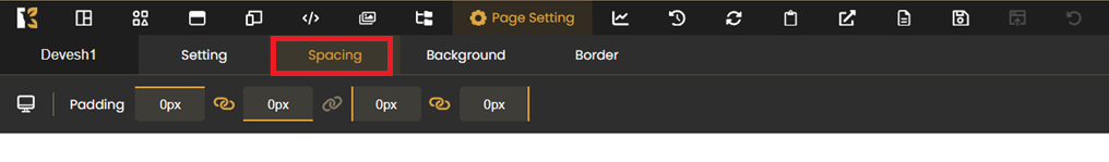
- ✏️ Step 3: Adjust Width, Height & Alignment
You can now:- Set Width & Height: Use pixels (px), percentages (%), or viewport units (vw/vh) to size your element.
- Adjust Alignment: Position elements left, center, or right within their container for better layout flow.

💡 Pro Tips:
- Use % or vw/vh for responsive sizing that adapts to different screen widths.
- Avoid fixed widths on mobile—test your layout on all devices.
- Use alignment tools to ensure visual symmetry and consistency.
By leveraging Kea Builder’s sizing controls, you can design pages that look great, work flawlessly, and adapt beautifully across all screen resolutions.