How to Manage Sizing of Each Element in a Webpage (Using KeaBuilder)
When designing your website, getting the right size and alignment of elements is key to creating a clean, balanced, and mobile-responsive layout.
Whether it’s an image, button, form block, or entire section, setting the right width, height, and alignment ensures your content looks professional and performs well across all screen sizes—from desktops to mobile devices.
📘 What Does "Sizing" Mean in Web Design?
Sizing refers to how much space an element occupies on the page. This can be defined by:
- Width: How wide the element appears
- Height: How tall the element is
- Alignment: How the element is positioned—left, center, or right
Proper sizing ensures a consistent layout, prevents elements from overlapping, and contributes to a mobile-friendly experience.
🛠 Step-by-Step Guide to Manage Element Sizing in KeaBuilder
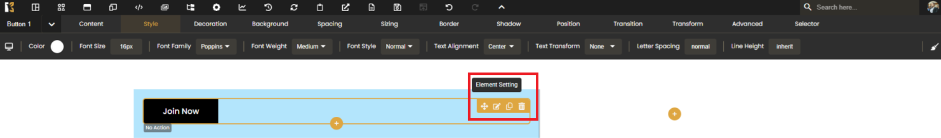
✅ Step 1: Open the Element Settings Panel
Click on the element you want to resize—this could be an image, text block, button, or section.
Then click the “Settings” (gear icon) located at the top-right corner of the selected element. This opens the control panel where you can modify properties for that element.
✅ Step 2: Navigate to the Sizing Option
From the settings panel, look for the horizontal slider menu that includes tabs like Layout, Shadow, Typography, etc.
Click on the tab labeled "Sizing" to open sizing-specific options.

✅ Step 3: Adjust Width, Height, and Alignment
Once in the Sizing tab:
- Width: Set the width in pixels (px), percentages (%), or auto. Example: 100% makes the element span full width.
- Height: Set height to maintain spacing or visual consistency.
- Alignment: Choose left, center, or right alignment within the parent container.
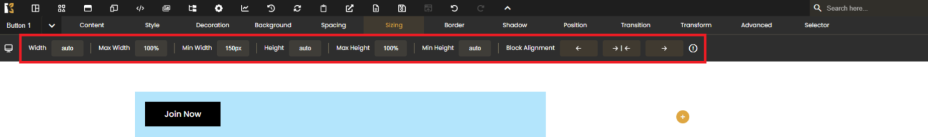
Use sliders or manually input values for precision control.
📱 Pro Tip: Always Preview Responsiveness
- Use the preview or mobile toggle in KeaBuilder to view responsiveness.
- Stick to
%widths for responsive design. - Test layouts in tablet and phone views.
- Combine sizing with padding and margin to adjust overall spacing.
💡 Bonus Tip:
If unsure about sizes, start with:
- Width: 100% for full-width sections
- Width: 50% or 33% for columns
- Height: auto for most text and images
Then tweak based on your content and design needs.
By properly managing the sizing of each element in KeaBuilder, you ensure your pages are visually appealing, well-aligned, and fully responsive—giving your users the best experience no matter what device they’re using.