How to Manage the Shadow of Each Element on a Webpage
Adding shadows to elements on your webpage is a simple yet powerful design technique that enhances visual depth and creates a modern, professional look. Whether you're working on buttons, boxes, images, or content sections—adjusting shadows can help distinguish elements from the background and improve your website’s overall aesthetics.
In KeaBuilder, customizing shadows is quick and intuitive. Here’s a detailed guide on how to manage the shadow for any individual element on your page.
🎯 What is a Shadow in Web Design?
A shadow effect simulates depth by making an element appear lifted or elevated. Think of it like holding a card slightly above a surface—light and shadow naturally follow. When applied thoughtfully, shadows can:
- Create visual hierarchy
- Emphasize important elements (like CTAs)
- Improve readability
- Add a polished, clean aesthetic
🛠 Step-by-Step Guide to Manage Shadows in KeaBuilder
✅ Step 1: Open the Element Settings
Hover over the element (text box, image, button, etc.) you want to modify. In the top-right corner of the element, click on the Settings (⚙️) icon. This opens the full customization panel for that element.

✅ Step 2: Navigate to the Shadow Settings
Inside the element’s settings panel, look for the horizontal slider menu—you’ll see multiple design options such as layout, spacing, border, etc.
Scroll or swipe through until you find the “Shadow” option. Click to open the shadow controls.

✅ Step 3: Adjust the Shadow Position
You’ll see various sliders and settings to control how the shadow appears. Begin by adjusting the shadow’s position, which determines where the shadow will fall relative to the element—top, bottom, left, right, or diagonally.
This helps simulate different light sources and design effects.

✅ Step 4: Fine-Tune the Shadow Properties
Here you can adjust several properties of the shadow for precision styling:
- Horizontal Position – Moves the shadow left or right
- Vertical Position – Moves the shadow up or down
- Blur Strength – Controls how soft or sharp the shadow edges appear
- Spread Strength – Controls how wide the shadow spreads from the element

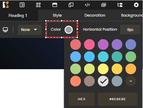
✅ Step 5: Choose the Shadow Color
By default, shadows are usually black or dark gray, but you can customize this to match your brand colors or theme.
Click the color picker to select your desired shade or enter a HEX code for precise control.
🔁 Repeat as Needed for Other Elements
This process can be applied to any element within your webpage. Whether you're working with images, containers, or call-to-action buttons—each element has its own shadow settings, giving you full control over your page’s design harmony.
💡 Design Tips:
- Use lighter shadows for minimal, clean interfaces
- Use stronger blur and spread to create more separation or depth
- Combine shadows with borders or gradients for enhanced visual appeal
- Always preview on desktop and mobile for responsive design consistency
By mastering element shadows in KeaBuilder, you unlock the ability to give your pages a modern, layered, and interactive look—without writing a single line of code.